ATS Chrono Reports
Chrono reports are used to create static report tables to match business standard templates.
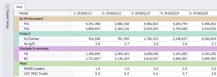
Sample schedule summary report.
Schedule Summary Sheet
This section details how to make a simple schedule summary sheet.
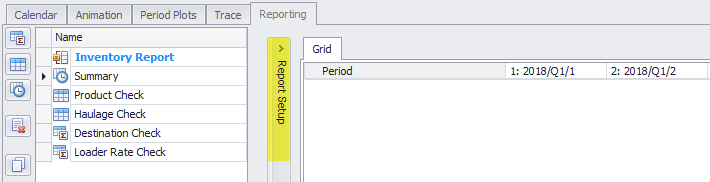
- Go to Schedule tab > Reporting tab >
 Add Chrono Report.
 - Click in the name field and rename to "Summary"
- Click 'Report Setup' to edit the report.
- Report rows can be added, removed, ordered, indented, copied and pasted using the top button menu.
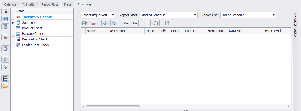
- Add the following rows:
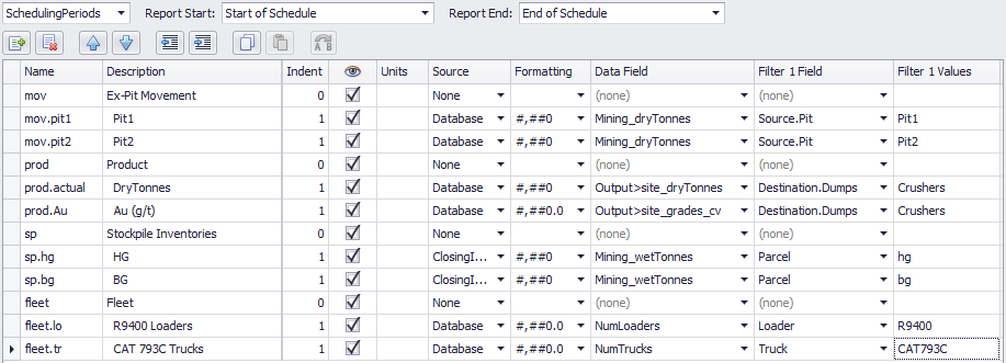
- Set the values in each column to match your data set.
- Name: this is an alphanumeric identifer used to create a unique lookup for the row, which can later be referenced in graph series and calculated fields.
- Description: table display name.
- Indent: creates nested table fields.
- Source: choose values from the Calendar, Database, Stockpile Inventories, or create a calculated field.
- Data Field: choose fields from the Source, or enter a calculation.
- Filter Fields: filter the data by these fields.
- Filter Values: filter the data where the filter field equals these values.
- Hit 'Refresh' or collapse the Report Setup to see the final report.
Setup Tips
Column Headers
To report monthly or yearly increments, open the Report Setup and select a time period in the top left of the form.
Copy Rows
When creating repetitive reports (ie. Pit1, Pit2, Pit3, ...), start by creating a table template. Once complete, highlight the rows and select the Copy  icon. Paste the copied rows and use the Find and Replace function to update the references.
Find and Replace Values
When editing or updating reports, use the Find and Replace  icon to quickly update a range of selected cells.
Filter Wildcards
The following wildcards can be used to filter the data:
| Available filters | |
|---|---|
| hg | Returns "hg" |
| hg? | Returns "hg" plus exactly one trailing character, ie. hg1, hg2, hg3 *note "hg" would be excluded in this filter, because it only has two characters. |
| hg* | Returns "hg" plus any number of trailing characters, ie. hg, hg1, hga, hg171101 |
| hg|bg | Returns "hg" or "bg" |
| !hg|!bg | Returns all parcels excepting hg and bg |
Calculated Fields
Calculated fields use a formula to reference the Name field of other rows. In addition to the formulas below, Excel-style addition and multiplication may be used.
| Available formulas | |
|---|---|
| V("prod.wt.ore") | Returns the value of "prod.wt.ore" in the current period. |
| PV("prod.wt.waste") | Returns the value of "prod.wt.waste" in the previous period. |
| CV("prod.wt.waste") | Returns the cumulative values of "prod.wt.waste" up to and including the current period. |
| CPV("prod.wt.waste") | Returns the cumulative values of "prod.wt.waste" up to the previous period (excludes current period) |
| S("prod.wt.*") | Sums all child fields of "prod.wt" in the current period (using asterisk as a wildcard for all children). |
| PS("prod.wt.*") | Sums all child fields of "prod.wt" in the previous period (using asterisk as a wildcard for all children). |
| SD(V("value1"),V("value2")) | Safe Divide value1 by value2. If value 2 is zero, the result is zero. |
| Math.Round(SD(V("value1"),V("value2"))) | Safe Divide result is rounded to the nearest even integer. |
| Math.Ceiling(SD(V("value1"),V("value2"))) | Safe Divide result is rounded up to the ceiling. |
| Math.Floor(SD(V("value1"),V("value2"))) | Safe Divide result is rounded down to the floor. |
| V("myValue") > 0 ? 1 : 0 | If "myValue" is greater than zero, return one, otherwise return zero. |
If the formulae has been incorrect previously, and you make a change to correct it, it won't turn black straight away. Switching to the Grid tab and then switching back will resolve this.
Chrono Charts
The Charts section below the Report Setup can graph any report row as a series, by referencing the row code in the Name field.
To add a chart:
- Press the blue plus icon to add a new chart.
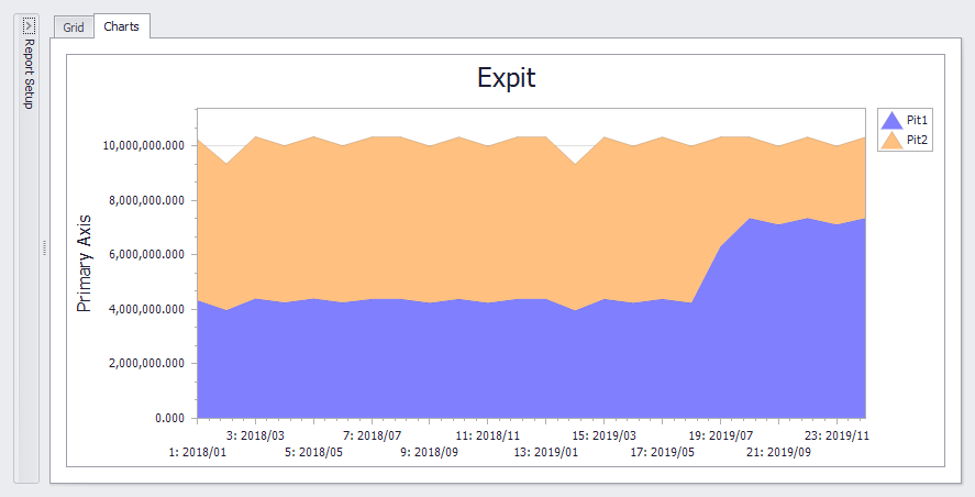
- Rename the chart to "Expit".
- Press the gear icon to configure the chart.
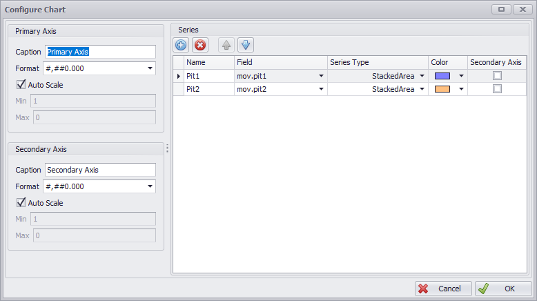
- In the configuration dialog, press the blue plus icon to add a new series.
- Rename the series to "Pit1".
- Drop down the Field selector and choose the "mov.pit1" series from the report.
- Drop down the Series Type and choose "StackedArea" from the list.
- Drop down the Colour selector and select a colour.
- Repeat steps 4-8 with "Pit2".
- Press OK to finish.
- Select the "Charts" tab in the Chrono report to see the results.